All projects

Sketch — visual identity

Golyeo Korea

Identity exploration for a traditional Korean restaurant.

The exploration

Visual identity research for Golyeo Korea, a traditional Korean restaurant. The goal: finding a universe that tells both the authenticity of the cuisine and a certain softness, without falling into cliché.

Two directions explored: one cute and pastel, inspired by Korean kawaii design; the other more traditional and understated. The work covered the logo, the palette and the business card.
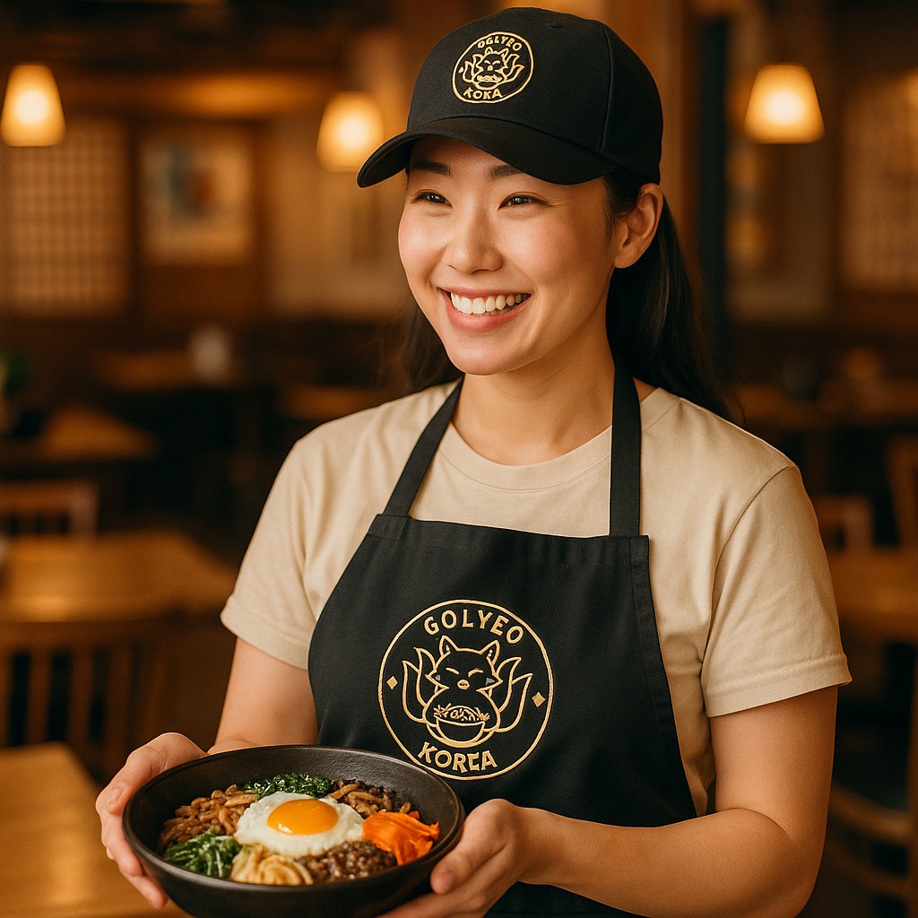
Golyeo Korea identity in context
The Golyeo Korea universe in context.

Logo directions

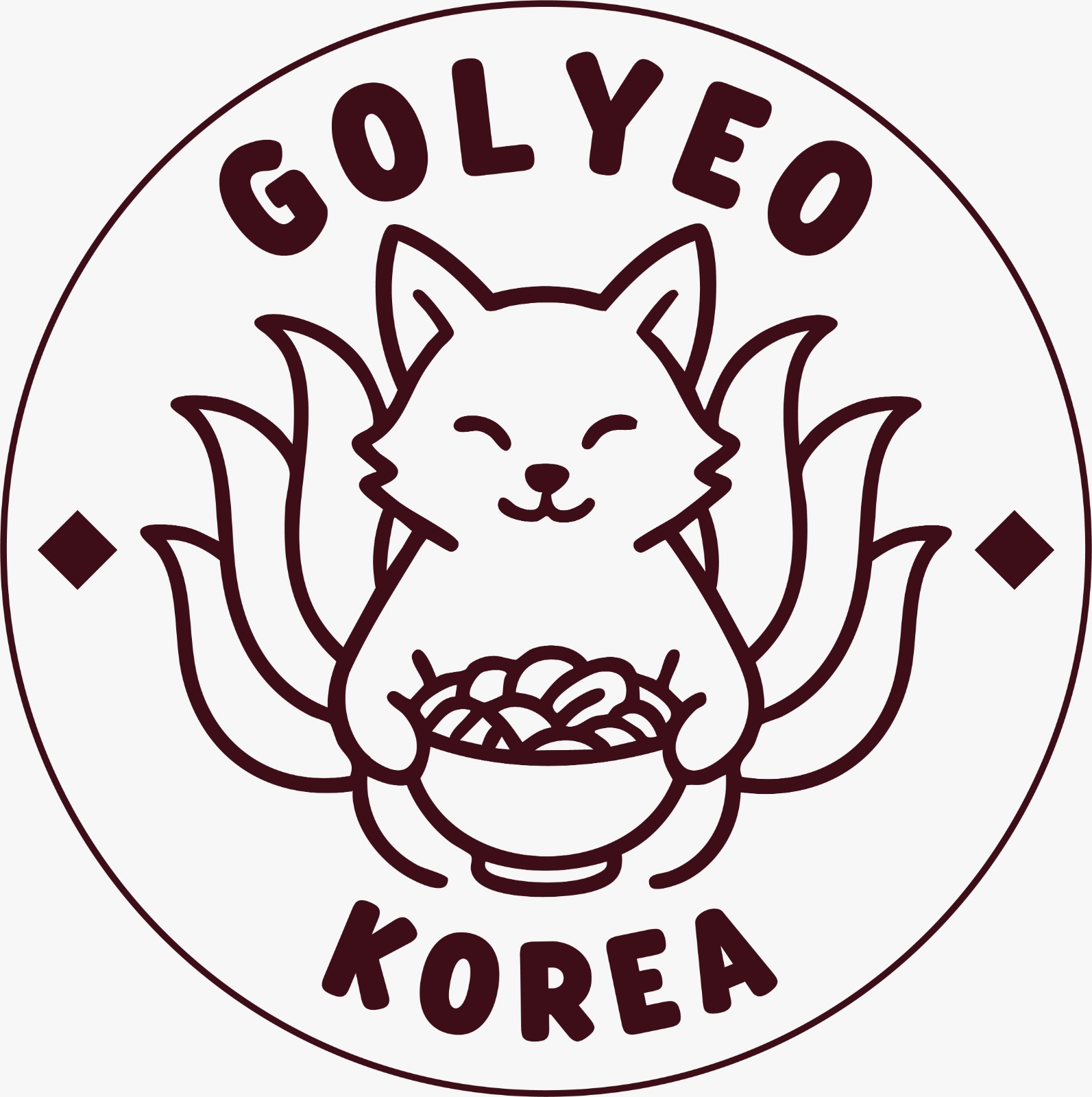
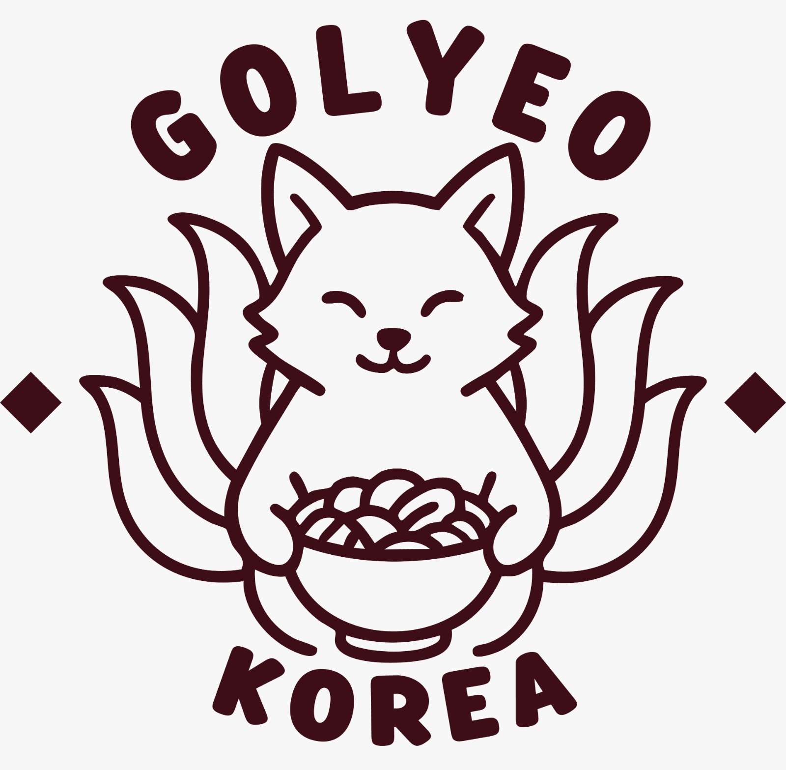
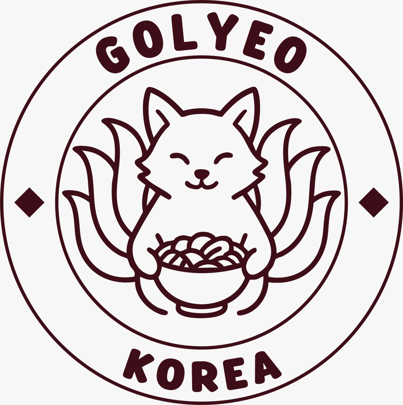
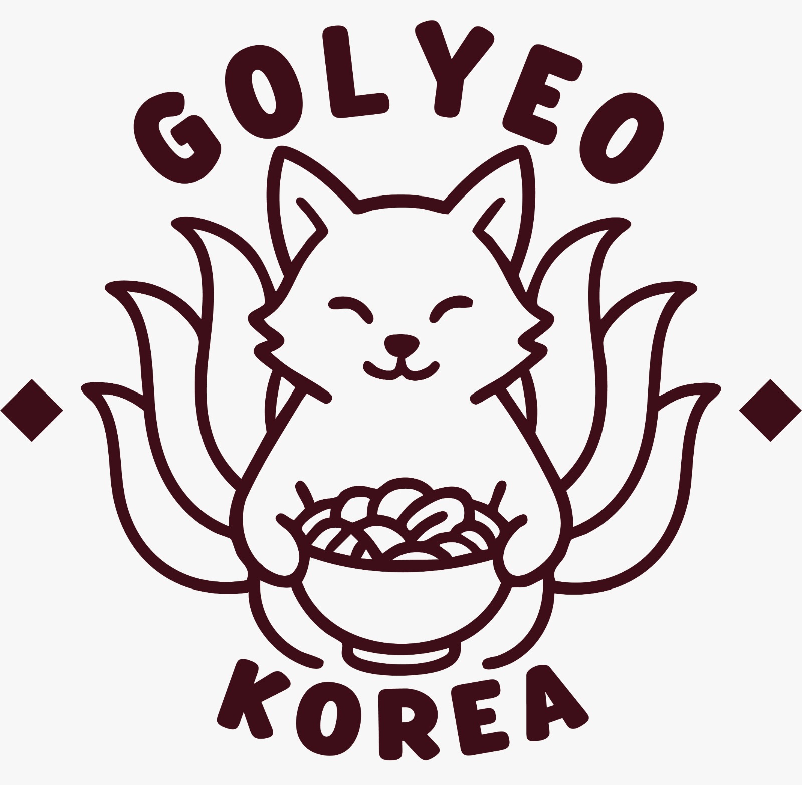
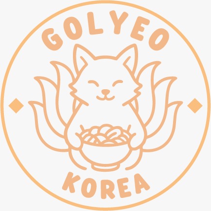
Direction 1: the fox inside a thin circular outline, GOLYEO arched above, KOREA arched below, a solid diamond on each side.Direction 2: the same composition without the circle, the two text arcs standing alone, diamonds pushed to the edges.Direction 3: a medallion version with a double outline, the text running along the ring and the fox enclosed in the inner circle.Direction 4: a circle-free variant, tails spread wider and the noodle bowl brought lower.Direction 5, pastel route: the whole logo in apricot orange, a thick circular outline, a more detailed fox drawing, diamonds brought inside the circle.

The business card

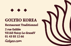
Golyeo Korea business card
Business card, traditional direction.