
UI redesign, kidulting direction
Pool & Splash
UI redesign of a pool retailer's website.
In short
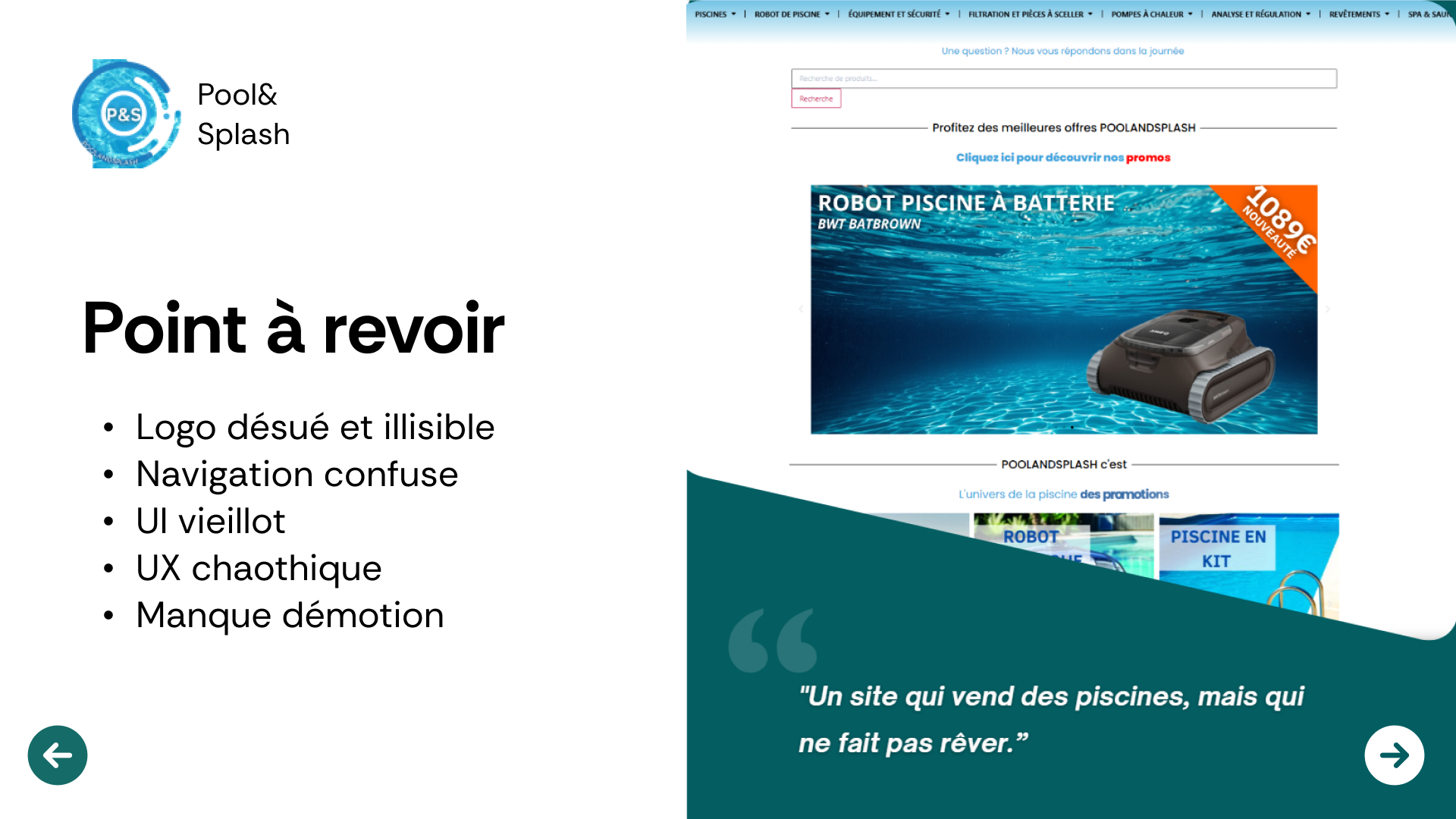
Taking a pool retailer's website that looked like a cold, dated catalogue, and turning it into an experience that makes people dream. The stance: embracing a playful, joyful, almost childlike tone where every competitor plays it straight. Summer, carefree days, the joy of diving in.
UI Design course project. Master's in Digital Project Management, F2i DSP. One week, in a sprint.
The idea
Every pool website looks the same. Blue everywhere, photos of pools, a smooth commercial tone. Nobody tells the real emotion of a pool: childhood summers, drinks by the water, the garden becoming a place to live. I wanted to take the complete opposite stance.
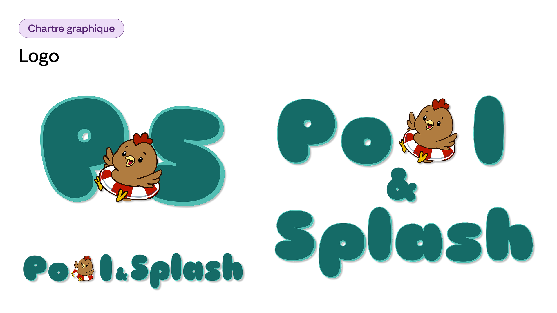
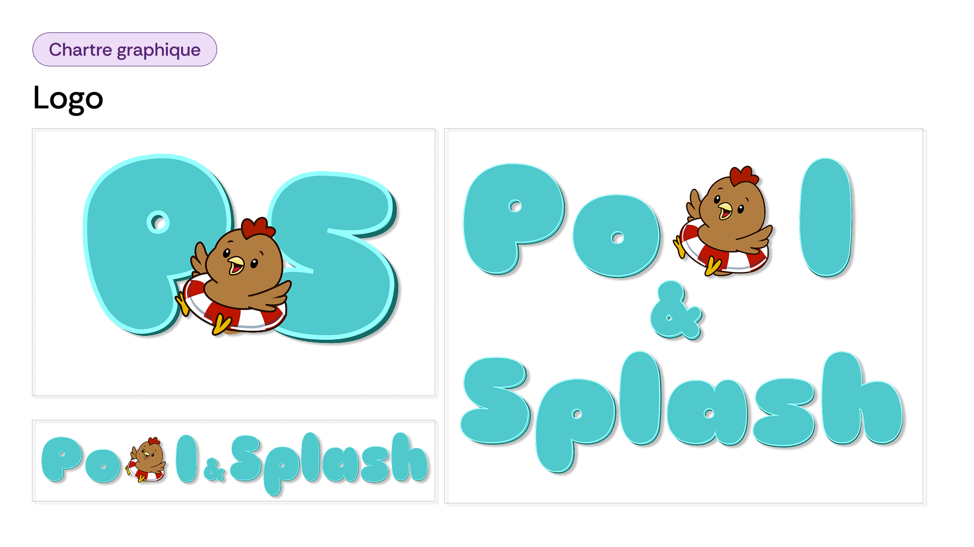
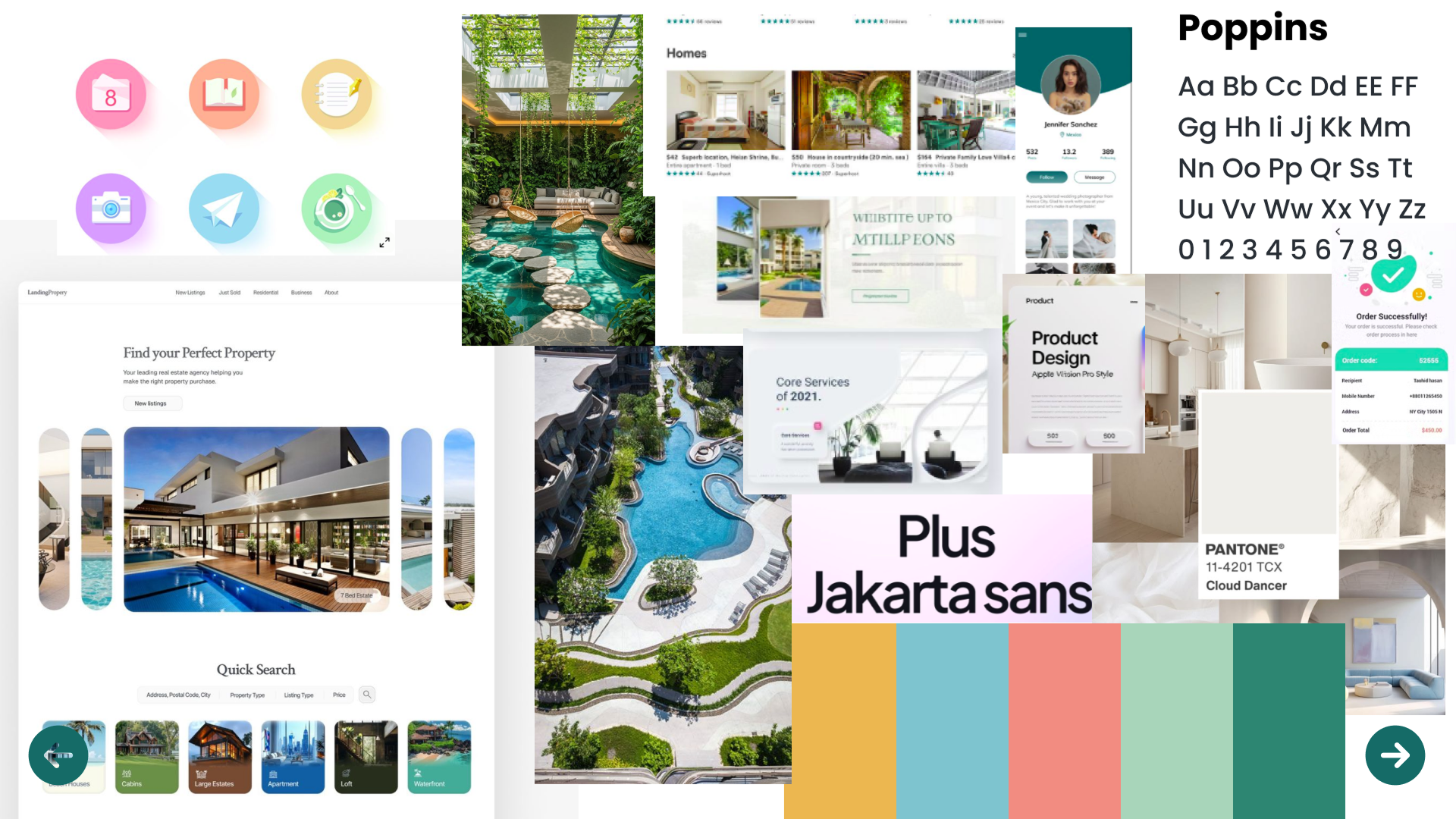
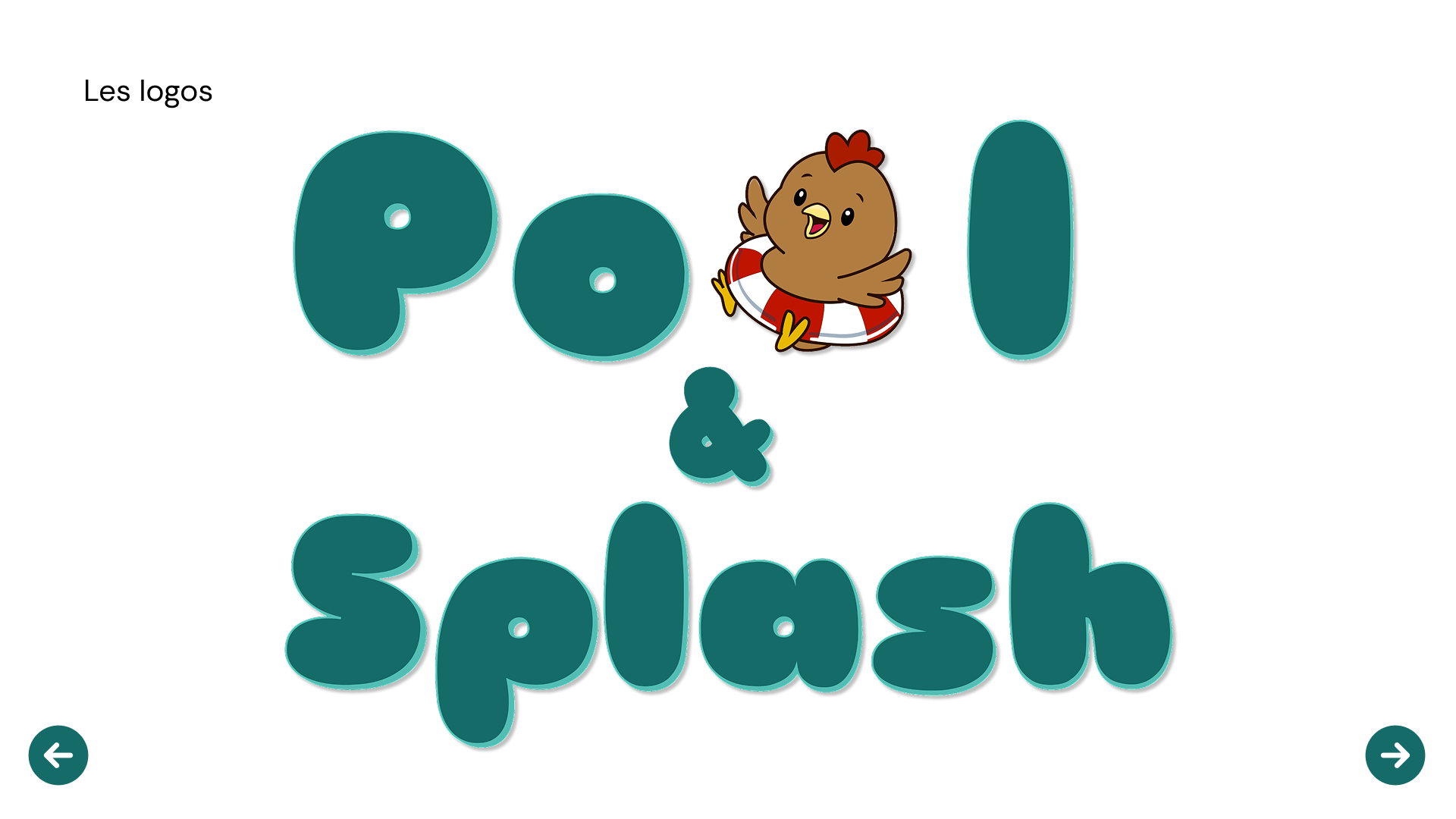
The art direction builds on kidulting, the aesthetic that injects childhood and play back into adult design. Zesty colors, a round, bubbly typeface, and an unlikely mascot: a hen in a rubber ring, who becomes the brand's common thread. Seriousness has no place here, and that's exactly the point.
What I produced
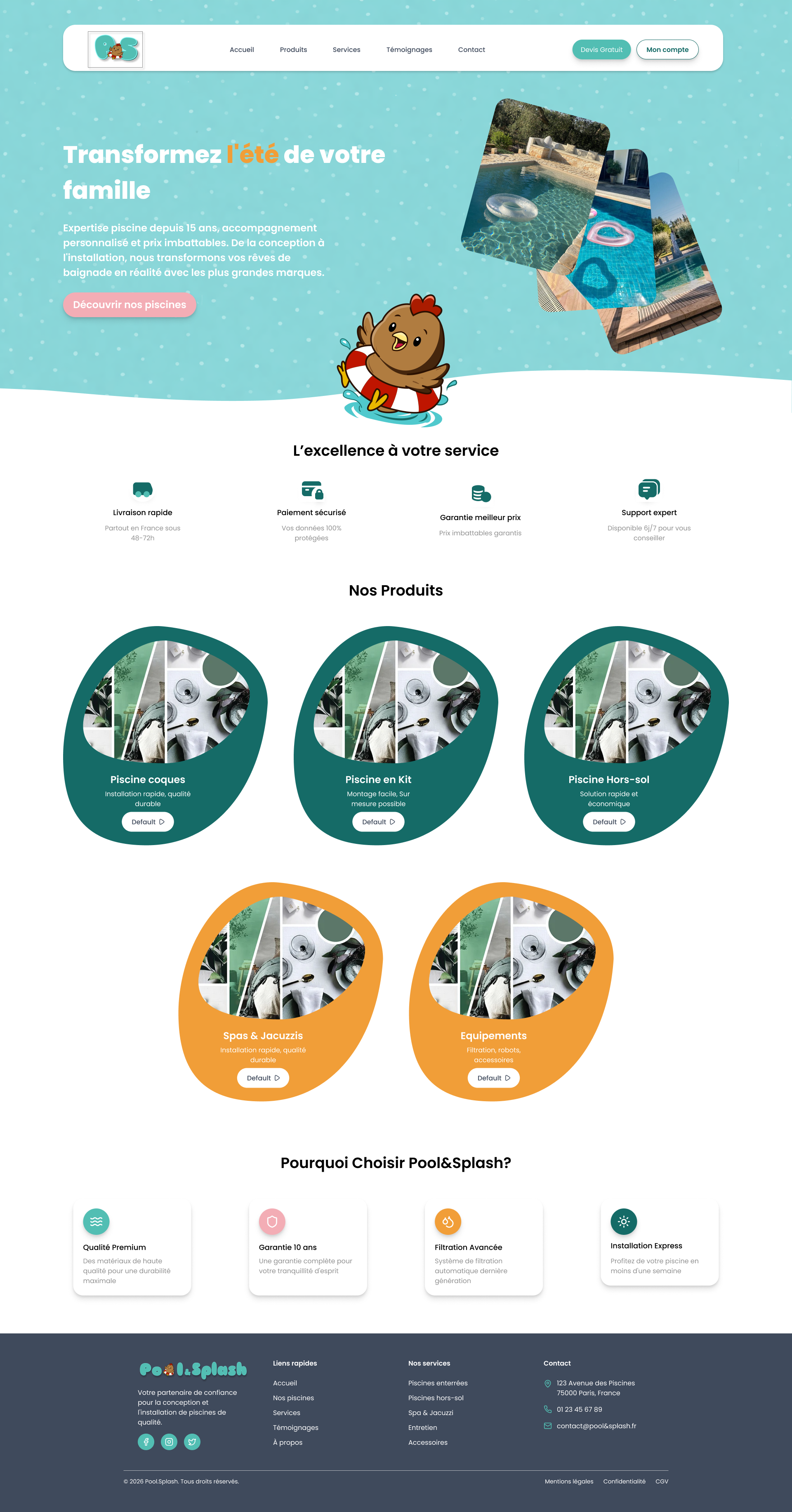
The redesigned home
A bright turquoise universe, a headline that speaks to families rather than buyers, pool photos staged as floating cards, and the mascot greeting the visitor. From a catalogue to an invitation.
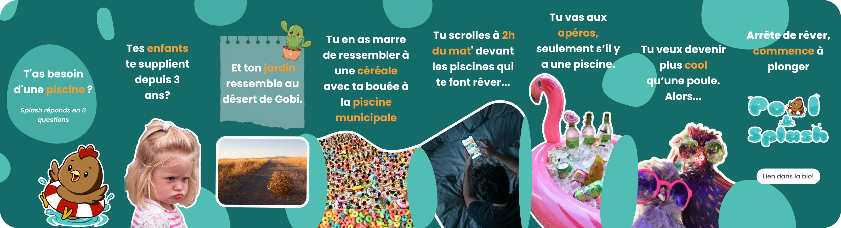
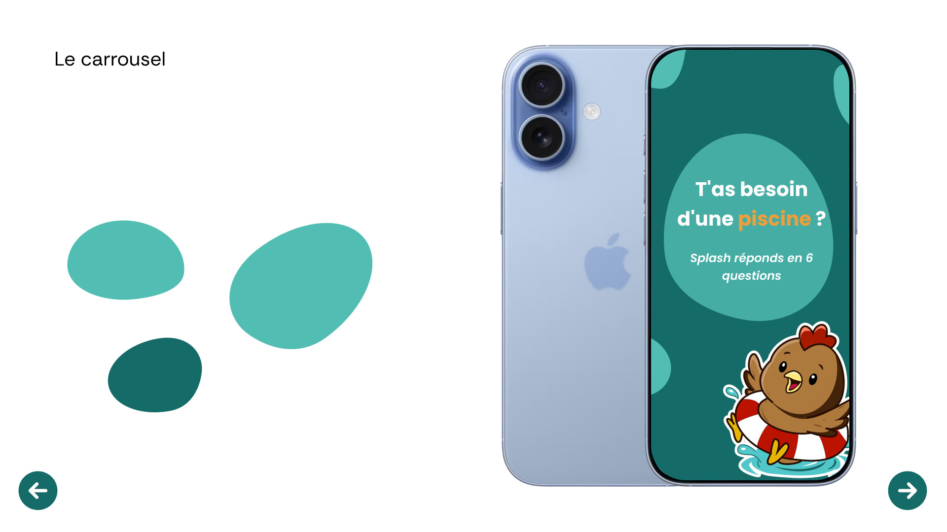
An Instagram carousel
Eight slides designed as a genuine social media hook. A playful tone, punchlines, a build-up to the call to action. “Need a pool? Splash answers in 6 questions.” The kind of content you want to swipe to the end.
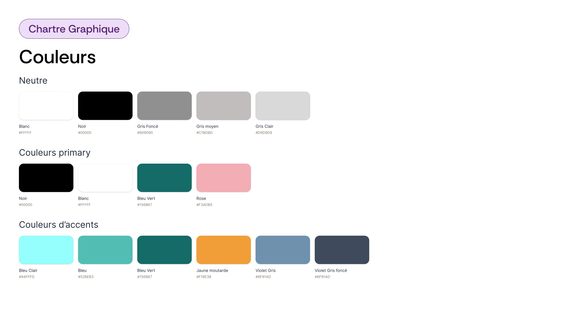
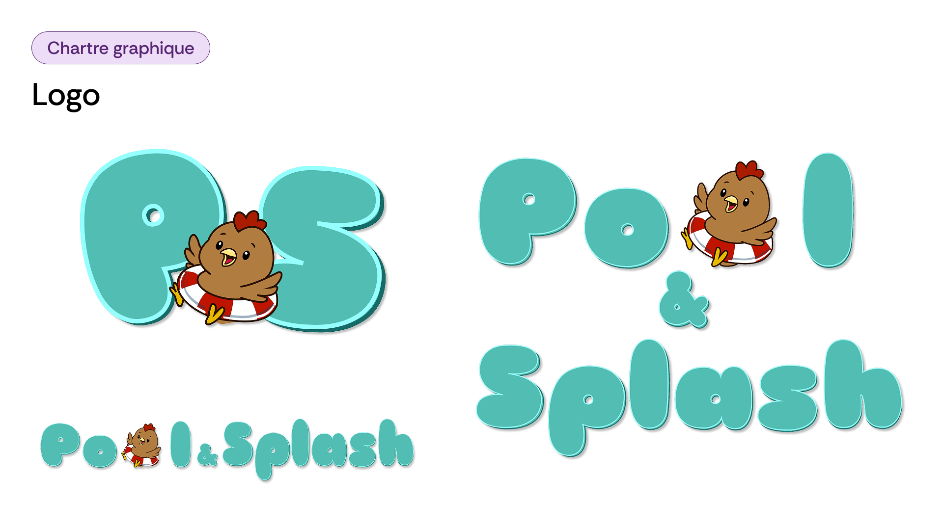
The visual identity
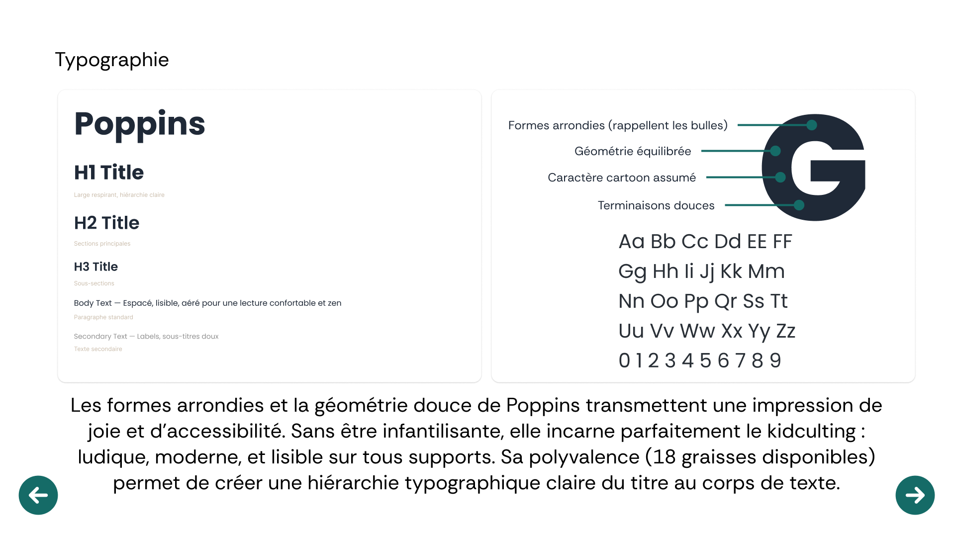
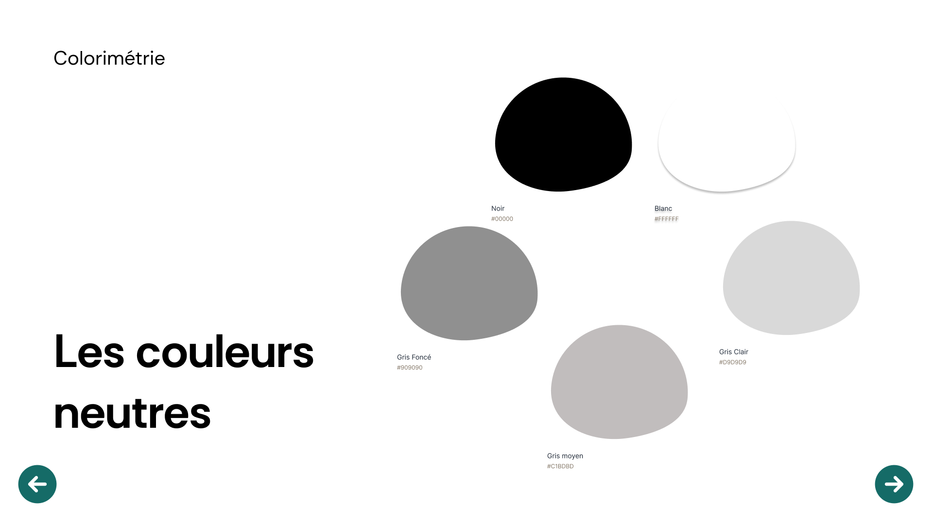
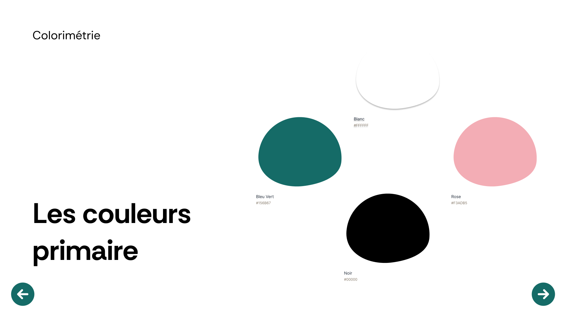
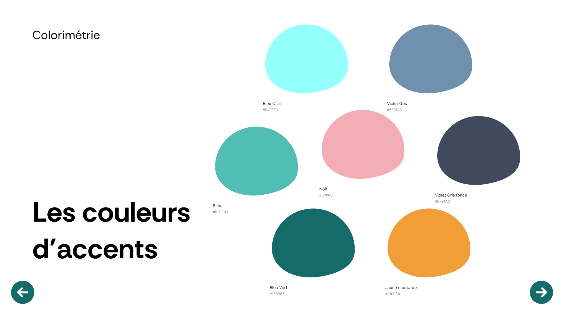
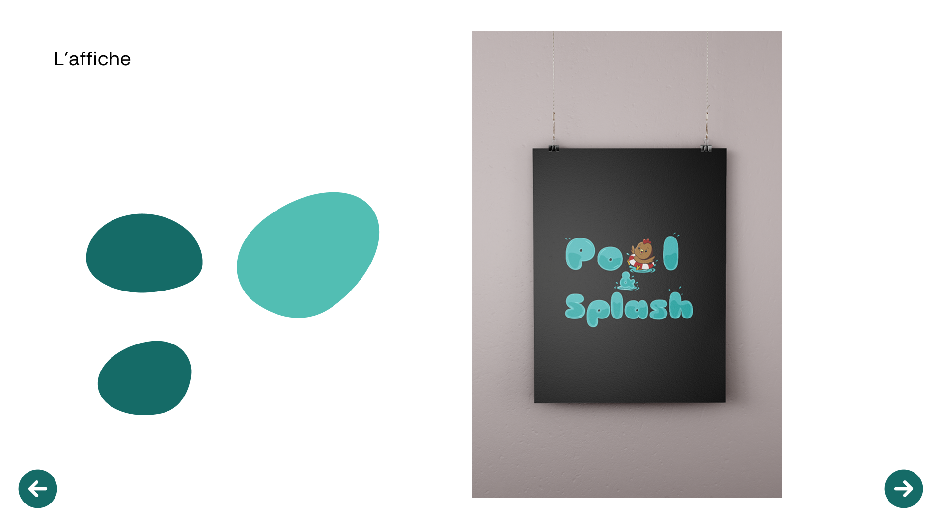
A zesty palette, Poppins typography, the mascot, graphic elements. A coherent system that holds from the first screen to the last slide.

What I take away
One week, short nights, and the gamble of daring a tone nobody dares in this industry. This is the project that showed me a strong art direction is decided quickly but holds for a long time. Once the hen was chosen, once the tone was set, everything else flowed from there.
I also learned that a website doesn't sell a product, it sells an emotion. The day I stopped showing pools and started telling summers, the project found its meaning.
The right tone isn't the expected tone. It's the one that makes people smile at the right moment.